


%20(1).jpg)
Lessons Learned from the Best Fintech Websites
Web design is an evolving process that is undergoing constant refinement as designers as clients and designers seek to design their websites for optimal performance. FinTech companies have the unique challenge of staying up-to-date with the latest web design trends while ensuring that their website is secure and compliant with regulations. To help make this process easier, we've gathered key lessons from some of the best fintech websites.
What makes fintech websites different?
Fintech websites face a number of unique challenges that require careful consideration. The most crucial factor is the need for a secure website. Fintech companies must ensure that their customers' financial data remains safe and secure, so it's essential to use the latest security measures.
A critical factor in designing a fintech website is ensuring that users can easily navigate the site and access vital information quickly. It's essential to build trust through a satisfying User Experience (UX), which begins with an excellent User Interface (UI). The UI and UX must be designed to appeal to the target audience while providing users easy access to the information they need. If you're interested in learning more about UX/UI, check our article on Figma vs. Developers, where we cover this in more detail.
Let's look at some examples of great fintech websites that demonstrate how to successfully take on the challenges of creating a secure, compliant, and user-friendly website.
8 of the best fintech websites to learn from
1. Wise
Wise is a UK-based fintech company that offers money transfer and foreign exchange services. The website features a sleek, modern design with clear navigation and easy access to the core features of its service. The site also complies with all the relevant regulations, making it secure and trustworthy.
Wise allows users to make global payments in multiple currencies easily and cost-effectively. On their homepage, the online calculator shows you not just how much money you would send or receive in a transfer but how they arrive at that calculation step by step. This openness helps to demystify the process and build trust with users.
The site is built around a predominantly white and blue color palette, which helps to keep the design minimal and modern. The simple visuals also help make complex information easier to digest.
Wise follows a trend popular in the best fintech websites and has a single landing page, with only a few additional pages to allow users to delve into features and pricing a little more deeply. The landing page provides a breakdown of all essential elements, such as security, and multiple variants of the same call-to-action, such as "Open an account" and "Order your card."
There is social proof on the site, with a link to Wise's Trustpilot page and videos of users discussing their experience with Wise, helping to boost trust. Overall, the design is straightforward and effective - proving that simplicity and openness are key in fintech website design.\
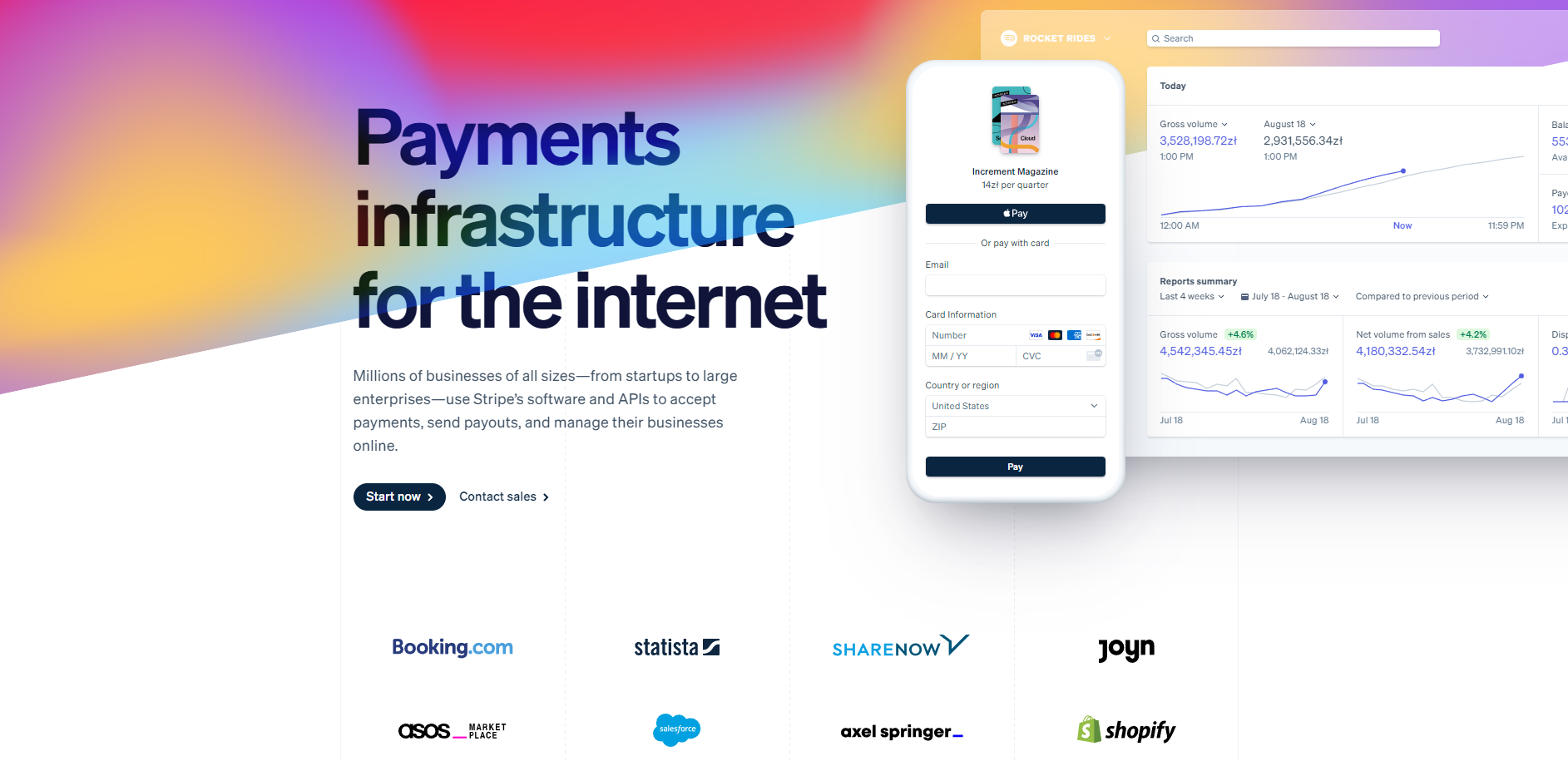
2. Stripe
Stripe is a global fintech company providing a platform for businesses to accept payments. They offer an array of services, from fraud protection and recurring billing to analytics tools and marketplaces.
The Stripe website has a modern yet elegant design that perfectly reflects the company's brand identity. The hero section is dominated by an animated splash of color that ebbs and flows against a dark-blue and white backdrop.
Stripe uses animation throughout its landing page, switching between examples of the app payments. These scroll slowly, unlike some sites that seek to rush as many examples past your eyes as possible.
Unlike Wise, Stripe's landing page links to a large library of products, which can be accessed through the menu bar or the page's footer. There are also many menu items for case studies, developer resources, etc., that highlight Stripe's target audiences; businesses, not individuals. The list of companies shown above the fold further reinforces that Stripe works with well-known brands.
The Stripe website offers a great example of how to design a fintech site that appeals to businesses successfully. The animated visuals, detailed product library, and list of existing corporate users demonstrate the company's trustworthiness and expertise in the field.
3. Monzo
Monzo is a UK-based digital bank offering various services, from savings accounts to overdrafts and insurance.
The Monzo site follows a trend set by many other fintech companies, using vivid colors and attractive visuals to draw attention. The mix of bright pink, cyan, and mint green helps users recognize the brand and remember its products. It also clearly suggests that Monzo is different from traditional banks.
Monzo's website is easy to navigate and provides a wealth of helpful information about its services, such as opening an account or applying for a loan. It also has detailed product descriptions, with static visuals demonstrating the features.
The landing page provides an overview of all the key features with simple but effective visuals and concise wording. The user journey is also thoughtfully crafted; when you click on a product link, you're taken to another page that explains more about the feature and how it can be used.
Unlike Wise and Stripe, Monzo offers customer feedback on their homepage, which helps to boost consumer confidence. While, naturally, the statistics they share about their user satisfaction rates paint them in a good light, they do acknowledge that some competitors come close or fractionally exceed them - a move that adds to their credibility.
Monzo provides an excellent example of how a fintech website should be built around the customer experience. The colors and visuals draw attention to the products, while the helpful information gives users all the necessary details. Its customer feedback further showcases Monzo's commitment to offering excellent service.
4. Betterment
Betterment is an online financial services company that helps users save and invest their money with the help of technology. Founded in 2008, Betterment has become one of the largest independent robo-advisors in the United States. It was one of the first companies to bring automated investment advice to retail clients, offering low-fee index fund investing with no minimum balance requirement.
The hero section contains the corporate logo of several publications that have reviewed Betterment and each logo links directly to the review. This reinforces Betterment's credibility and helps to draw attention to the product. As expected, a menu bar in this section allows interested users to explore other products and learn more about the company.
As with all the best fintech websites, the Betterment website features a relatively simple design. The site is dominated by white and yellow spaces and contrasting blue tones, which helps to draw attention to the services on offer. Clear illustrations demonstrate the app's appearance and purpose, while the concise text offers users a quick explanation of the products.
Each section of the landing page contains a simple call to arms, each a variant of "Get started." Betterment does this well, keeping each section brief and to the point, with an accompanying graphic and a simple button to direct users to the next step.
The Betterment website is an excellent model for fintech companies. Its clean design makes it easy to understand, and its clear call-to-action drives users to the appropriate product page. The presence of external reviews also helps build consumer trust and confidence in the company's services.
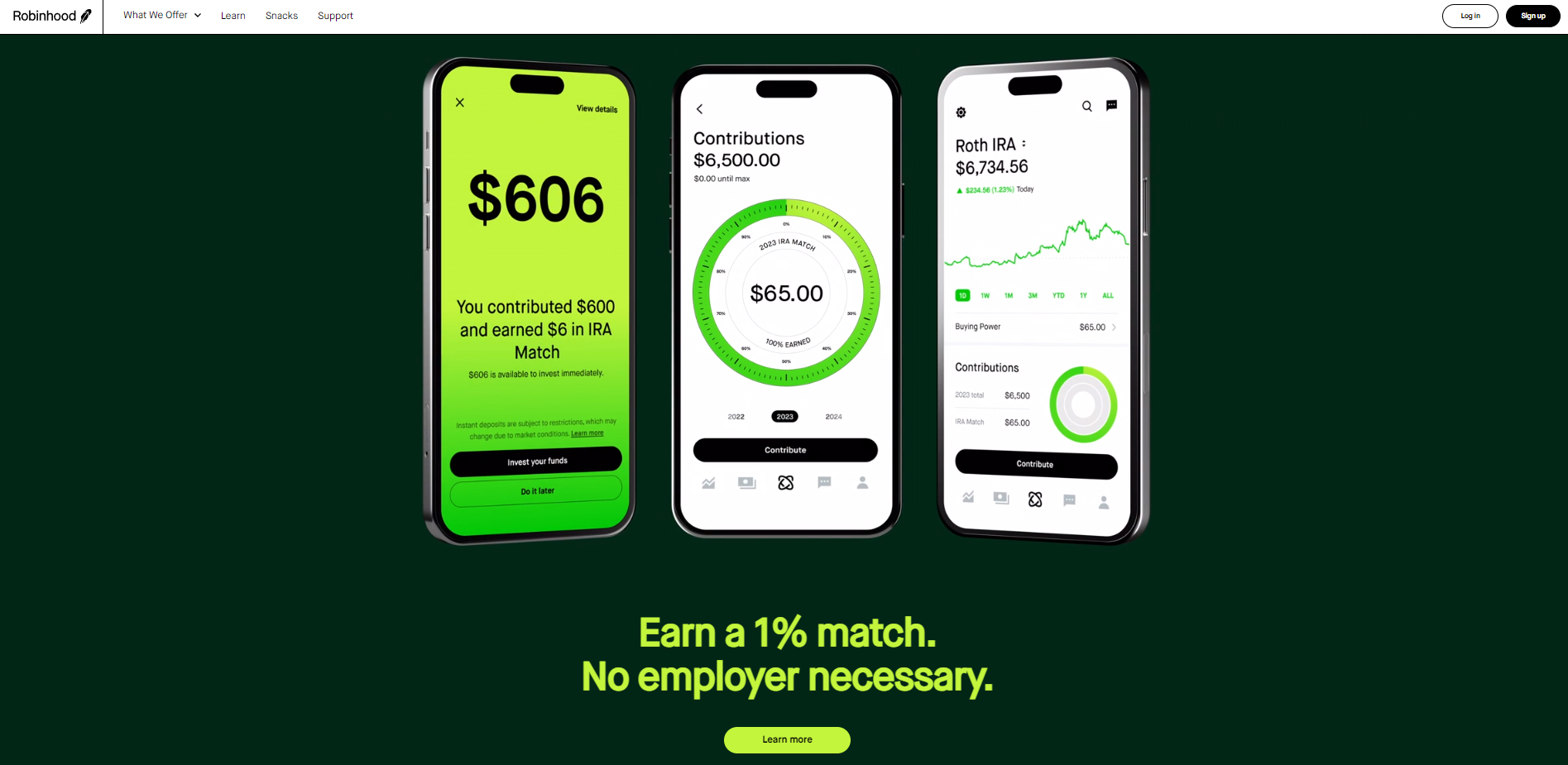
5. Robinhood
Another great fintech website, Robinhood, targets millennials and offers a free stock trading platform. Founded in 2013, Robinhood's mission is to democratize finance for all. The company has grown rapidly and boasts more than 10 million users. Robinhood gained popularity after introducing a free trading option, which has helped make stock investing accessible to more people.
Visuals of the app in use on mobile phones dominate the homepage. This illuminates the product's primary use case and gives customers a clear image of what they will engage with.
Unlike other sites, Robinhood's landing page features only one call to action - "Learn more," There is little else to the page other than links to the latest articles from their blog. This keeps the page simple and uncluttered.
The only thing that lets Robinhood down is the menu bar, or more specifically, the array of different-looking pages that it sends you too. The menu offers Invest, Crypto, Retirement, and Cash Card, among others, and each has a different design, which is unusual for a fintech website design. However, each is liable to attract a specific audience.
Most visitors to Robinhood already know about the app through social media streams, such as Reddit's infamous WallStreetBets subreddit. It is unlikely that the site's visuals, rather than its content, are the primary attraction for new users. For the landing page and Invest tab, the visuals communicate a sense of excitement and promise about what Robinhood offers - with a green and white color pallet that symbolizes profitable trades.
Overall, Robinhood's website does an excellent job of communicating the key features and benefits of the product. It also uses visuals to draw attention and motivate users to take action while keeping the page uncluttered by limiting content. This is an effective example for fintech companies looking to present their services simply but engagingly.
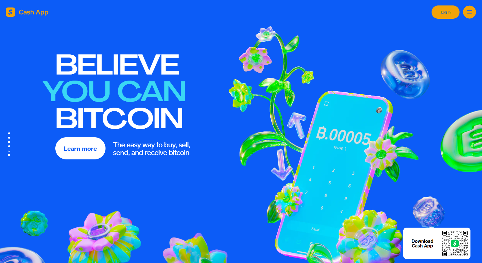
6. Cash App
Cash App is a fintech service from Square, Inc., which allows users to transfer money quickly and securely. The hero section of the homepage is bright and animated with fast-moving elements that suggest a youthfulness that aligns with its target audience.
A QR code on the screen allows visitors to scan it with their phones and download the app quickly. This is the primary call to action, with each following section simply offering to allow visitors to "learn more."
The QR code reappears in the bottom right of the screen when you scroll down for easy access and to remind visitors throughout their journey that they need to download the app.
The key driver of Cash App is to show how easy it is to use, and with that in mind, the site does not initially show you a menu bar, although instructions to various aspects of the app can be accessed through the button hovering in the top right corner of the page, beside a login button.
The simplicity of Cash App's website is its main strength. With everything you need to know front and center, visitors can access the product quickly and learn more if they choose.
Cash App's website is an excellent example for fintech companies looking to simplify their online presence, by keeping content minimal and placing emphasis on visuals.
7. Rocket
From the moment you land on the page, Rocket makes it clear that their app is for controlling and managing your finances. The site features a pallet of white, black, and red, giving simplicity and elegance to the design.
The hero section of the page is an animation of a phone bearing the app. At a glance, it is possible to see that the app seems simple to use and is meant for the everyday person.
The page then moves into a section that provides social proof from the 3.4 million members, the average rating, and logos of new sites that have reviewed the app.
Perhaps most important is the care given to copywriting on the site. Headers have been crafted to highlight pain points users may be having, such as "Get control over your subscriptions" and "stay on top of spending." This is exactly the kind of messaging that resonates with the audience Rocket is targeting and encourages them to download the app.
Below the features list is more social proof, in this case, a scrolling list of comments
The imagery and visual design on the site are simple but effective, allowing visitors to visualize how they can use the app.
Rocket is an excellent example of a fintech company looking to present its services simply and effectively. The visuals and copywriting combine to tell a story about the product, highlighting its features and benefits while still keeping it accessible for non-technical users. This is a practical approach for any company looking to target a wider audience with their product.
8. Venmo
Venmo is an online payment platform owned by PayPal and designed for friends to exchange money quickly and easily. The page's hero image shows two people using their phones, accompanied by the words "Pay friends," which immediately communicates the purpose of the product visually.
The landing page features several sections that showcase the app's features, such as making payments in both directions, sending reminders, and customizing payments with emojis. Each section includes visuals of how each feature works.
The call-to-action inviting users to download the app and use it for free is prominent at the top of the page and takes you to a sign-up process reminiscent, unsurprisingly, of the PayPal process.
As users scroll down the page, a tab will appear and sit in the bottom right, repeating the call-to-action "Get Venmo."
The concise copy accompanying the array of visuals on the Venmo site is also well-crafted and captures its users' attention. Venmo has seamlessly integrated visuals, copywriting, a sign-up process, and a prominent call-to-action to create an effective website for its product.
Venmo has created an engaging website that quickly communicates its purpose and encourages people to try the product. By focusing on visuals and highlighting the app's features, Venmo shows itself to be one of the best fintech websites, being both informative and visually appealing.
Build your perfect fintech website today
If you're looking for a way to take your fintech business to the next level, contact us today at Qarbon IT and let us help you create the perfect website. We're here to provide you with the best possible service and ensure that your fintech product gets the attention it deserves.
.jpg)


.jpg)
.jpg)
.jpg)
.jpg)
%20(1).jpg)
.jpg)
.jpg)
.jpg)


.jpg)
.jpg)
.jpg)
.jpg)
.jpg)
.jpg)
%20(1).jpg)
%20(1).jpg)
.jpg)
.jpg)
.jpg)
.jpg)
.jpg)
%20(1).jpg)
.jpg)
.jpg)
.jpg)
.jpg)
%20(1).jpg)
.jpg)
.jpg)
.jpg)
.jpg)
.jpg)
%20(1).jpg)
.jpg)
%20(1).jpg)
.jpg)
.jpg)
.jpg)
.jpg)
.jpg)
.jpg)
.jpg)
%20(1).jpg)
.jpg)

.jpg)

.jpg)
.jpg)
%20(1).jpg)
.jpg)

.jpg)

.jpg)
.jpg)

%20(1).jpg)
.jpg)
.jpg)
.jpg)
.jpg)
.jpg)
.jpg)
.jpg)
.jpg)
.jpg)
.jpg)
.jpg)
.jpg)
.jpg)
.jpg)
.jpg)
.jpg)