


It is generally accepted that the New Year is the best time for changes. We reflect and consider ways to improve. As Qarbon IT, we also conducted such an analysis and with the new year, we made quite a few changes, related to our brand image and branding.
We have been in the market for over 3 years and have grown significantly. Our team has expanded, and we have established valuable business relationships. Our core values have taken shape. We have expanded beyond the Polish market and are now making inroads into foreign markets. As a company with experience and a strong market position, we felt it was necessary to rebrand to align our image with who we are now and how we want to be perceived in the future.
That's why we present the Qarbon IT rebranding process - from A to Z.
Why did we decide to rebrand?
When we first considered rebranding, we knew that the timing was right. We felt a strong need for change, but we also wanted to make sure that it was what our customers needed, as the brand image affects them the most. The brand should inspire trust and attract the audience. So, we conducted thorough research on how we were perceived by our current and potential customers, as well as current and potential employees. The results provided valuable insights that helped us embark on the rebranding process.
1. Our previous image was inconsistent
Our research and observations revealed that our existing image was confusing. The layout of our online content was inconsistent, with a variety of colors, shades of blue, elements, and styles. This made it difficult for viewers to immediately associate it with our brand. We realized that we needed to improve this. A consistent brand image inspires more trust and is perceived as professional, which is what we strive for as a company.
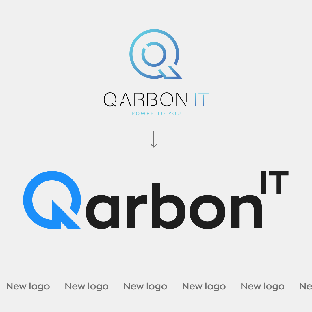
2. Indistinct logo
The most crucial part of a company's image is the logo. It should be simple but also associated with the brand. After examining our old logo, we determined that it needed simplification and greater clarity. Hence, we decided to make changes to it.
3. Improved communication
We aimed to better communicate our expanded services and their importance to our customers. Our core values have evolved over the past 3 years and we felt the need to clearly define our narrative, both on and off our website. This is crucial, especially in the rapidly evolving IT industry where technologies and trends are constantly changing. We wanted to present ourselves as a modern company.
4. Our brand needs to stand out
The IT industry is one of the fastest-growing industries in the world.. We had to break through the sea of competition and highlight why our brand should be the best choice for the customer. We aimed to create a unique and memorable brand that would differentiate us in the market. Rebranding allowed us to redefine a bold image that would be noticed and remembered in the competitive IT industry.
Meet the final result
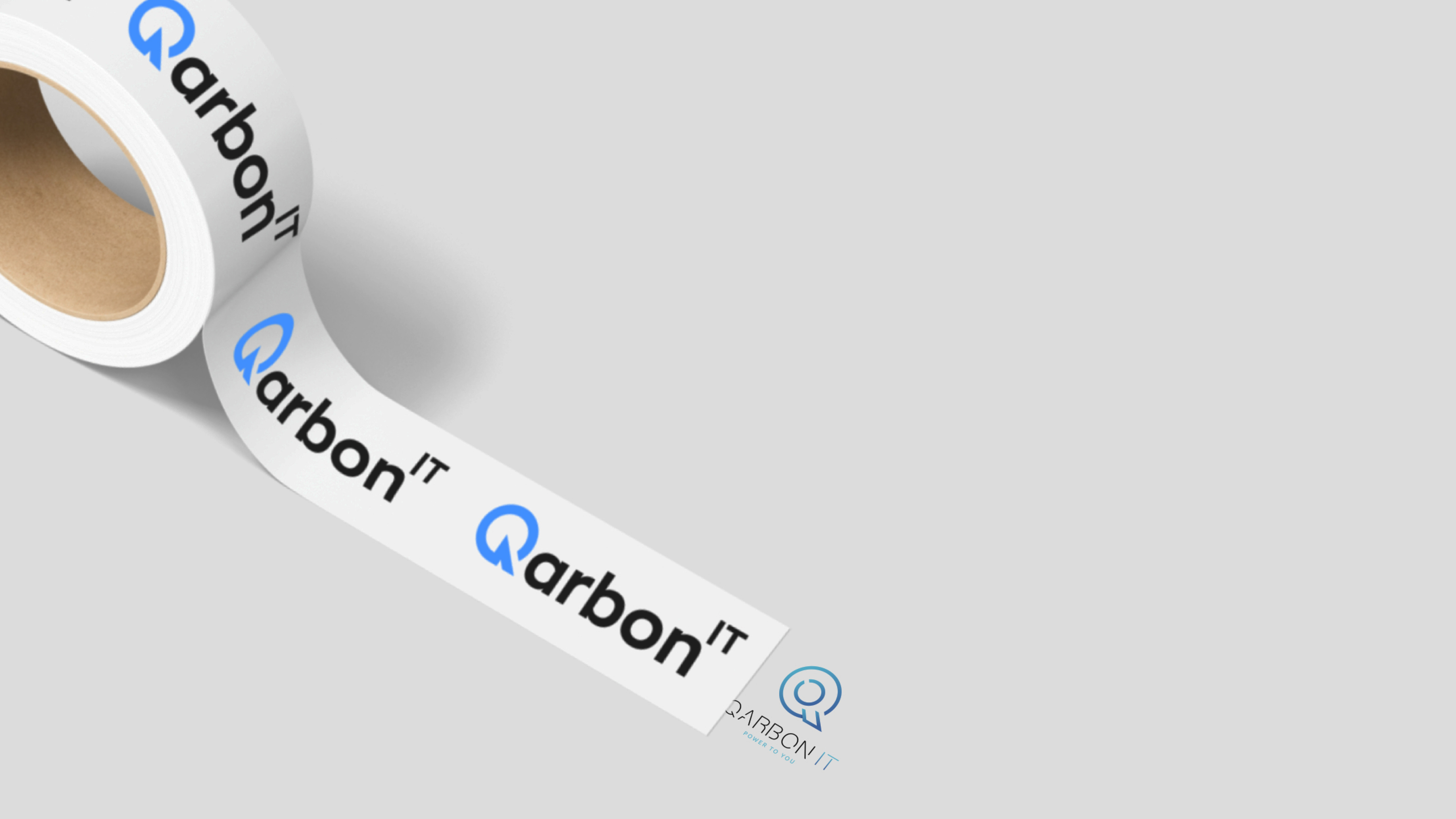
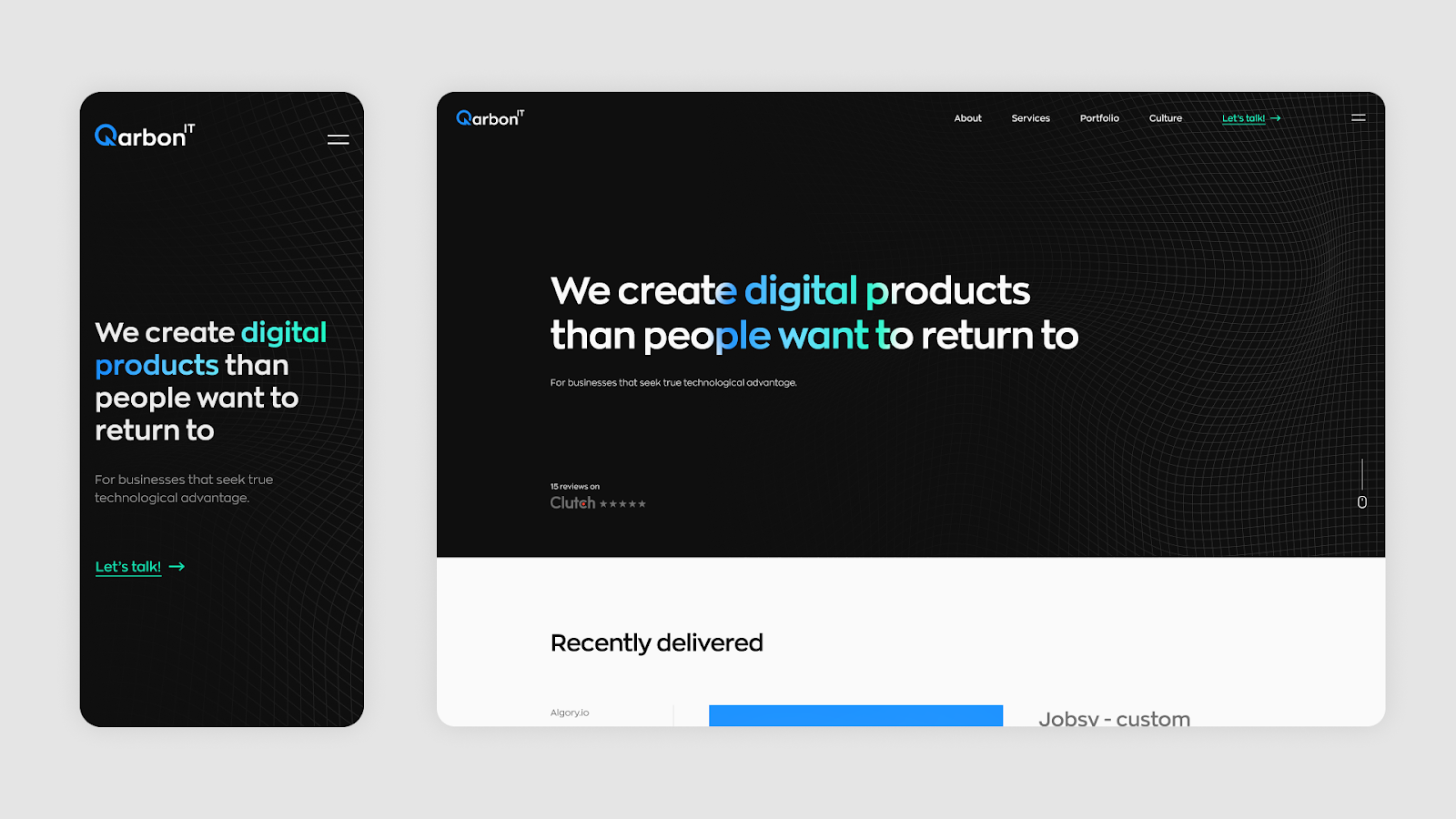
New logo
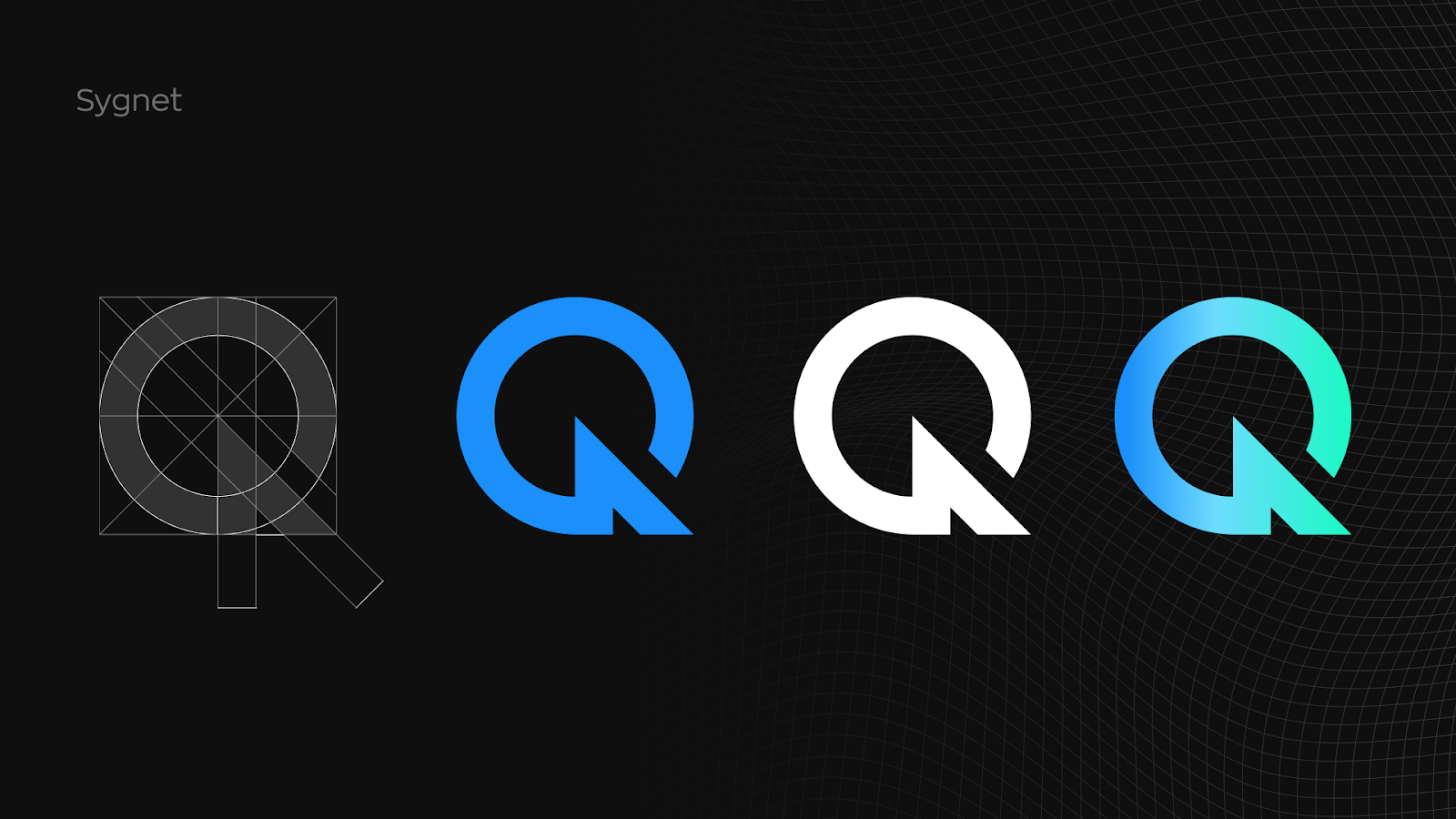
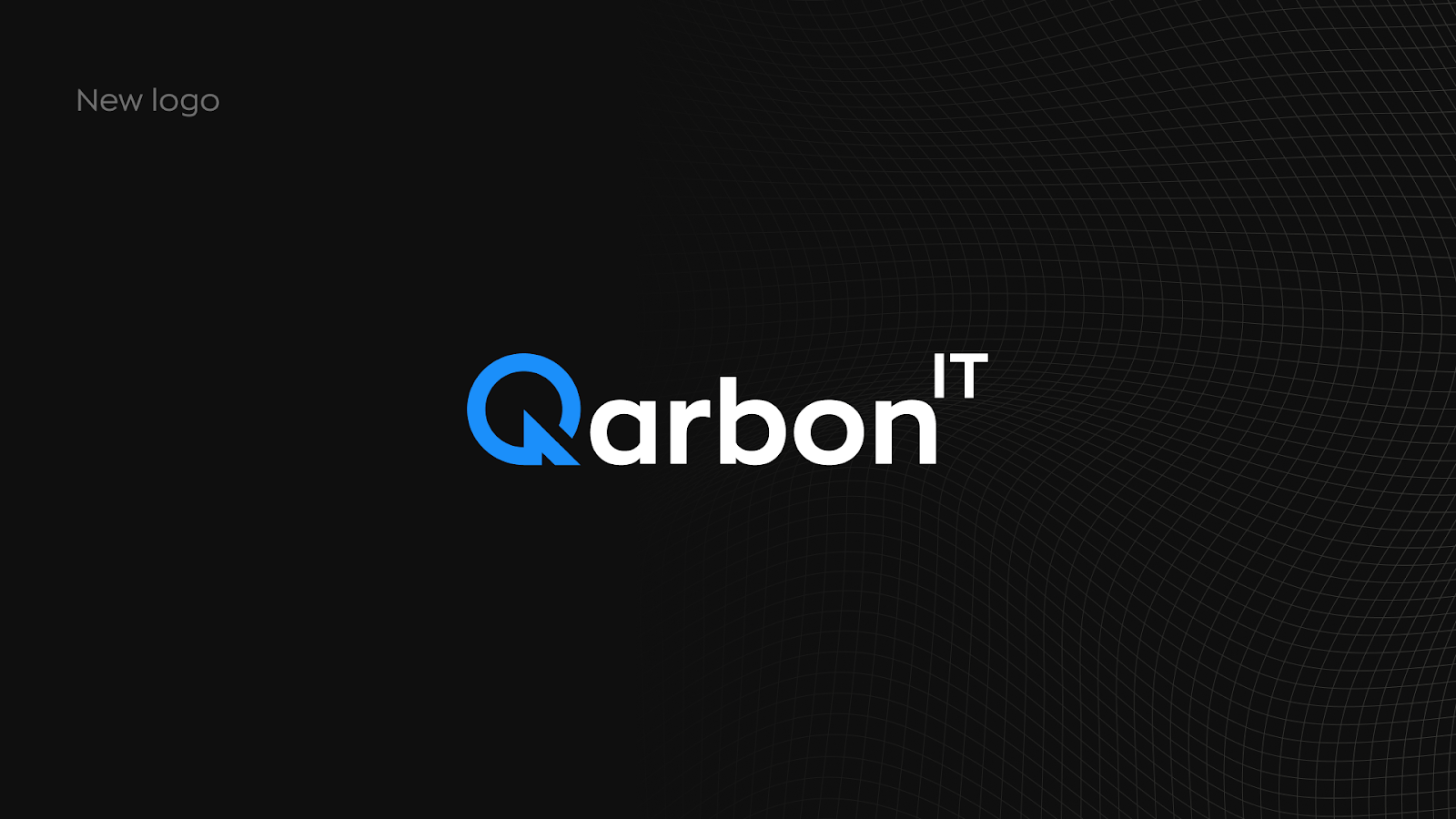
We opted for a stronger contrast and clearer yet simpler shapes. The signet is a refresh of the Q from the old logotype. The new version refers to the start, a symbol of the process and setting a new direction. And that's what we want to be associated with - as we improve business processes and set a new direction by providing dedicated software solutions. Both the symbol itself and the logo as a whole are more visible and clearer. It is associated with modernity, which is what we are.
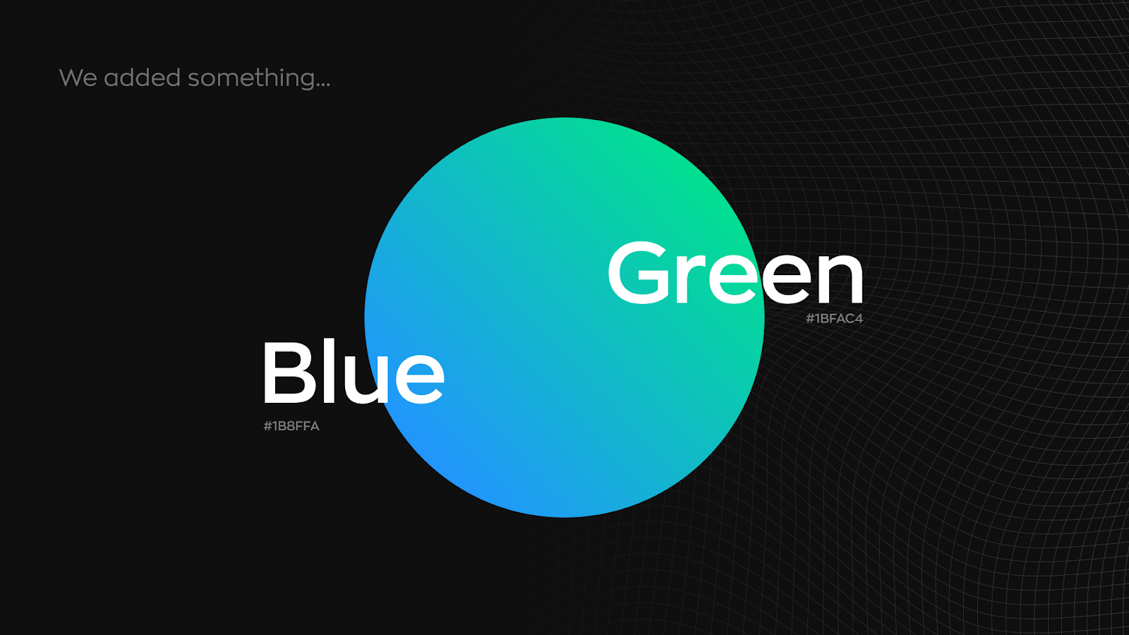
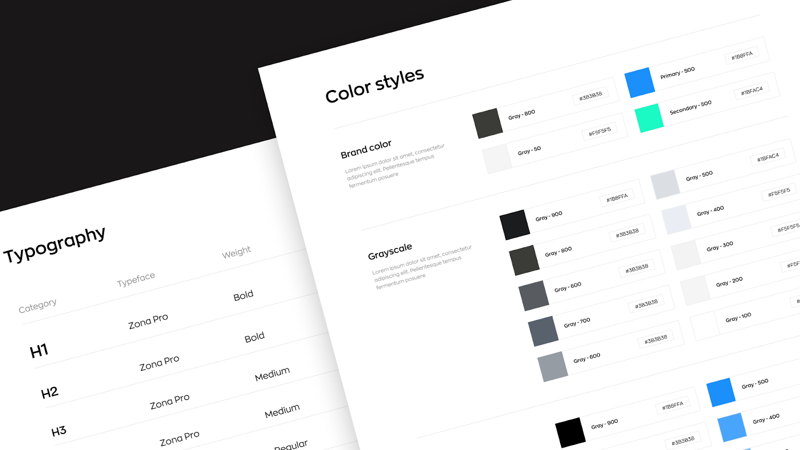
New colors
We did not change the color palette, but only refreshed it and slightly expanded it. Our main color used to be blue - a color associated with trust. In addition to the trust, we also wanted to add a touch of freshness. That's where the green came from - undeniably a color associated precisely with freshness, something new. The resulting gradient makes us stand out from the crowd and visually vibrant. It also provides a great contrast to the strong black. Such a combination definitely brings to mind the IT theme.
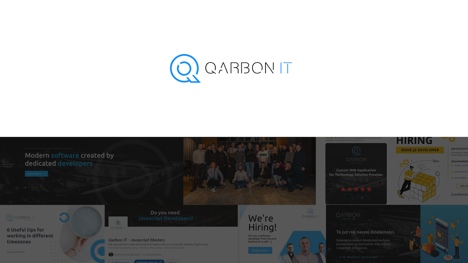
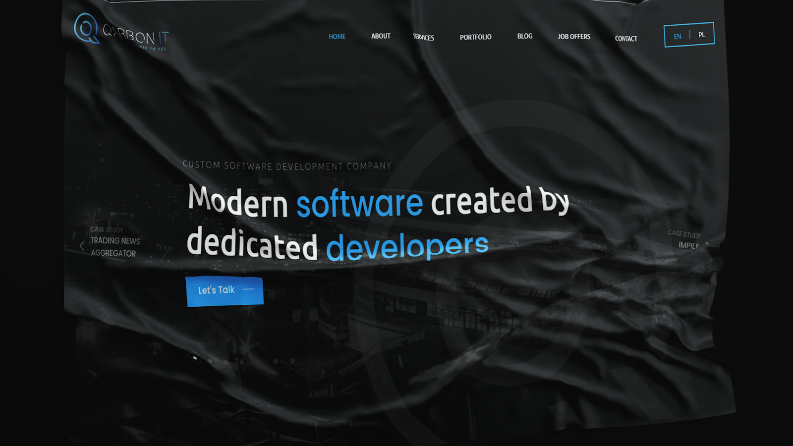
New website
Along with the rebranding, it was time to refresh the website. We made it more consistent with the rest of the identity, and modernized it, in addition to improving the content and User Experience. Now our message is easier to perceive, and the user can easily learn about our entire range of services. We have expanded the information about the company and made it more likely and frequent to be visited. In addition to the business content, we also showed a more human face - because a company is all about people. They are the ones who take care of the customer's needs and make the partnership run in the best conditions. That's why there are a lot more of us on the site - so you can see who we are and the values we represent, as a company and as people.
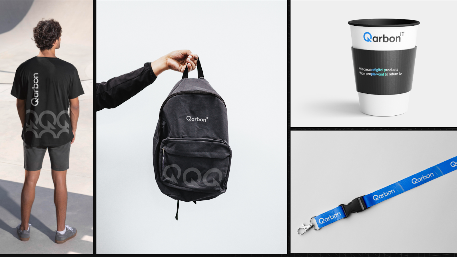
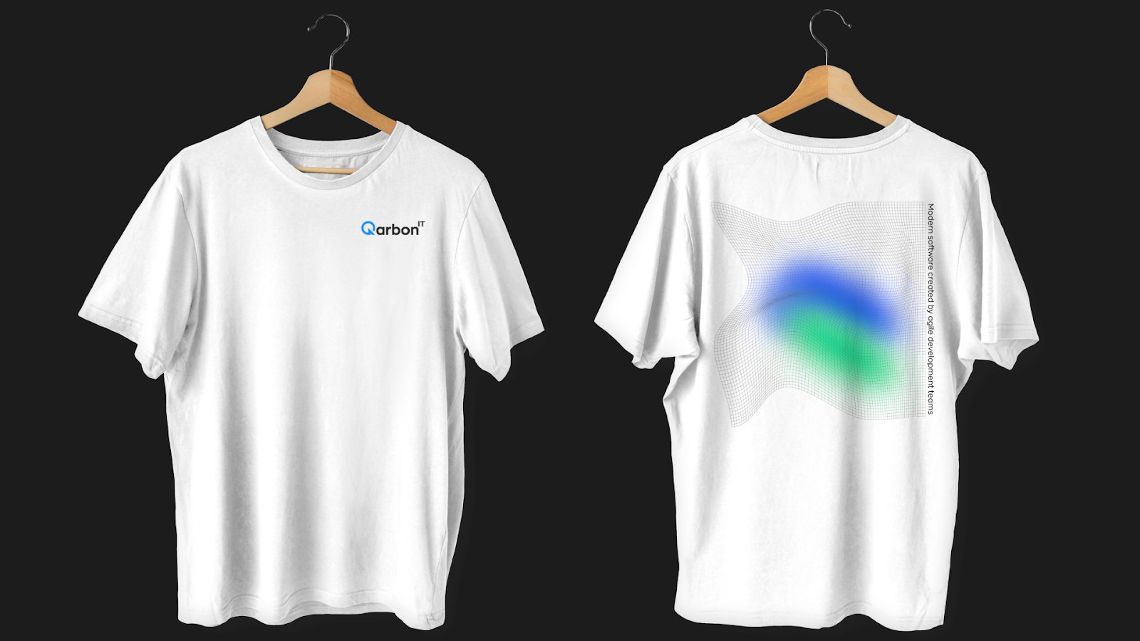
New visual identity
Our mission is to create digital products with passion, creativity, and the latest technology.
Qarbon IT's core values are:
- Extraordinary - We give our best and feel responsible for the results
- Curiosity - we are eager to learn
- Employee-focused -we are focused on building a friendly work environment
- Trustworthy - we are trustworthy people
Our vision is to guide customers through digital transformation and create products for them that revolutionize their business. At the same time, we want to be the best company to work for, because our employees are our greatest value.
We want to present this to you through a new visual identity. Our message and tone needed to be more direct and expressive - this is the look and feel of Qarbon IT's visual identity.
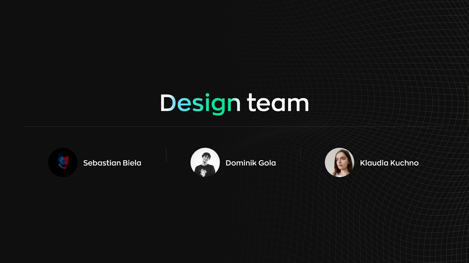
Our branding masters
Our talented and irreplaceable team of graphic designers worked on the rebranding of Qarbon IT. They were the ones who took care of the process from A to Z and achieved such an amazing result.
Sebastian Biela, Dominik Gola, and Klaudia Kuchno - great job!


.jpg)
.jpg)
.jpg)
.jpg)
%20(1).jpg)
.jpg)
.jpg)
.jpg)


.jpg)
.jpg)
.jpg)
.jpg)
.jpg)
.jpg)
%20(1).jpg)
%20(1).jpg)
.jpg)
.jpg)
.jpg)
.jpg)
.jpg)
%20(1).jpg)
.jpg)
.jpg)
.jpg)
.jpg)
%20(1).jpg)
.jpg)
.jpg)
.jpg)
.jpg)
.jpg)
%20(1).jpg)
.jpg)
%20(1).jpg)
.jpg)
.jpg)
.jpg)
.jpg)
.jpg)
.jpg)
.jpg)
%20(1).jpg)
.jpg)
%20(1).jpg)

.jpg)

.jpg)
.jpg)
%20(1).jpg)
.jpg)

.jpg)

.jpg)
.jpg)

%20(1).jpg)
.jpg)
.jpg)
.jpg)
.jpg)
.jpg)
.jpg)
.jpg)
.jpg)
.jpg)
.jpg)
.jpg)
.jpg)
.jpg)
.jpg)
.jpg)
.jpg)